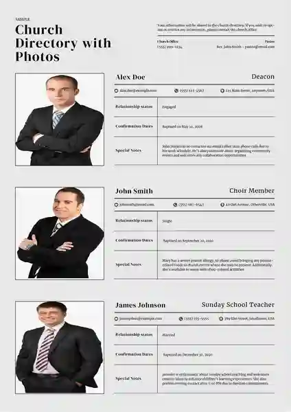
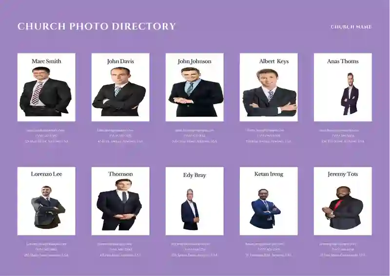
A church directory with photos is like a big family album for your church. It helps everyone get to know each other and builds a stronger community. But a directory with pictures is even better! Pictures make it way easier to remember names and make your church feel friendlier. This article will cover everything you need to create an excellent church directory with photos.
Get our step-by-step guide to making a beautiful church directory with photos. We cover design, privacy, photos, and more!”
What is a church directory?
Essentially, it’s a list of your church community. It includes members’ names, contact information, and other details tailored to your church’s needs.
Think of it like a family photo album + address book for your church.
What’s usually included in a church directory?
Here’s a deeper look into the common elements found in a church directory:
The Basics:
- Names: Everyone’s full name is listed. It’s essential to spell these right! Sometimes, people include nicknames or titles, like “Pastor Sarah” or “Dr. Lee.”
- Addresses: This is how the church sends out cards, newsletters, or invites.
- Phone Numbers: People might list their home and cell phones.
- Emails: This is the primary way to reach someone with a quick message or question.
Photos:
- Picture Types: Most directories have headshots, but some have family photos or fun everyday pictures. The key is to keep them all a similar style.
- Why Photos? They help you remember who’s who! It’s easier to say hello when you picture the person’s face.
Family Groups
- How it Works: People in the same family are listed together, showing their relationship (mom, dad, kids, etc.).
- The Benefit: It makes the church feel like a big family and helps new people get to know everyone faster.
Extra Info
- Birthdays: Sometimes, these are included so the church can send birthday wishes. For privacy, some directories show the month and day.
- Church Groups: This shows if someone sings in the choir, helps with kids’ stuff, or volunteers in other ways. It helps people with the same interests connect.
- Other Stuff: Churches might add things like when someone got baptized, how long they’ve been a member, or even their job skills.
Essential Things to Think About
- Privacy Matters! It’s okay for people to say they don’t want specific info in the directory. Photos are great, but always ask before using them.
- Easy to Read: How stuff is organized makes a difference! Clear headings and spaces keep it from being a jumbled mess.
Old School vs. New School
- Printed Booklets: This is how it used always to be done.
Online Directories are becoming popular. You can change things easily; sometimes, only church members with passwords can access them.
Printable Church Directory with Photos Template


What’s the best format for a Church directory with photos?
Here’s a breakdown of common formats and their pros and cons:
Common Options:
PDF:
- Pros: Great for printing, maintains layout across devices and is harder to edit accidentally.
- Cons: Less ideal for frequent updates; may not work well on all web platforms.
Word/Excel:
- Pros: Familiar programs for many, easy to edit initially, can be printed or exported as PDF.
- Cons: The layout can shift depending on devices/software versions, as well as larger files with many photos.
Online Directory Platforms: (Like Instant Church Directory, Breeze, etc.)
- Pros: Designed for directories, offers search functions, easier updates, and can control access.
- Cons: Often subscription-based (costs involved), less flexibility on design in some cases.
Factors to Consider:
- Distribution: Printed booklet? Online access? Both?
- Updates: Will you frequently update photos or information?
- Tech Comfort: Are you comfortable working with PDF spreadsheets, or do you prefer a dedicated platform?
- Security: Is controlling access a priority (printed vs. password-protected online)
- Budget: Are there costs associated with certain formats or platforms?
Recommendation:
PDF is a great option if you want a beautiful, printable directory that won’t change frequently.
Why Church Directories important?
Here’s why they’re so helpful:
- Names and Faces Finally Match: It’s nice to see familiar people at church, but knowing everyone’s name makes it even friendlier. A directory lets you put a face to the name, so you can finally say “Hi, Emily!” instead of just smiling awkwardly.
- Helping Newcomers Feel at Home: Starting at a new church can be overwhelming! A directory lets new members browse and see friendly faces. It might help them find someone who lives nearby, has the same hobbies, or even shares their love of silly hats!
- Building a Stronger Community: Directories remind us that church is more than a Sunday service. They show the whole community of people who worship, laugh, and help each other out.
- A Keepsake of Memories: Years later, you might flip through your old church directory and remember special moments. You’ll see how kids have grown up, recall past events, and maybe even get teary-eyed about old friends.
Why Put Photos in Your Church Directory?
- Connecting Names with Faces: Sometimes it’s tricky to remember everyone’s names, especially in a big church. Photos help you match a face to the name, making it easier to say hello and feel connected.
- Feeling Like You Belong: For new members, a photo directory helps them feel like they are part of the family right away. Even long-time members feel closer to each other when they can visualize the whole community.
- A Special Keepsake: A well-made directory with photos becomes a treasured item. People enjoy looking back and seeing how their church family has grown over time.
How to Get Great Member Photos
Photo Day Fun:
Think of it as a mini-fellowship gathering. Have some simple snacks, drinks, and upbeat music playing softly in the background.
If lots of families will be there, a designated colouring or craft table will keep little ones occupied while parents get their pictures taken.
Host your “Photo Day” around the same time each year. This helps people remember and plan for it.
Tell People What to Expect:
When you announce Photo Day, include a few examples (e.g., a formal headshot or a relaxed photo). This lets people visualize how it will look.
Emphasize that they should come as they feel comfortable. Church clothes are fine, but so are everyday casual outfits!
Let people know it’s not about getting the “perfect” shot. They can retake their photo if the first one doesn’t feel like ‘them.’
Don’t Rush It:
If possible, offer a few Photo Day sessions (maybe a Sunday morning or a weekday evening) to accommodate different schedules.
Announce the deadline in church bulletins, emails, etc., but keep the tone friendly and not urgent.
Be Flexible:
Make sure people know it’s perfectly fine to use a nice photo they already have, especially if they’re uncomfortable getting a new one.
For entries without photos, instead of a blank space, use a simple graphic (like a leaf or a cross). This looks more intentional.
If someone declines to participate, don’t question them. Smile and reassure them it’s no problem.
Photo Day Tips
Set up your photo area in a well-lit part of the church. A simple backdrop (plain sheet or wall) helps. Have a few chairs for people to sit on if needed.
Designate: If possible, designate someone who enjoys photography to take most of the pictures. This helps with consistency.
Have friendly volunteers greet people, answer questions, and help anyone who might be camera shy feel comfortable.
Lighting & Backgrounds
Set up near windows or outdoors (on a slightly overcast day is ideal).
Find a spot with lots of bright, indirect light. Avoid harsh overhead lights or lamps that directly face the subject.
Solid-coloured backdrops are the easiest to create. A plain wall, a sheet, or even a patch of greenery outside works well!
Formal vs. Casual Photos
Do you want classic church directory headshots or more relaxed waist-up photos? Let everyone know ahead of time!
Even in formal photos, encourage genuine smiles and relaxed expressions.
During your event, take some candid photos of people chatting, etc. These are great for informal pages in the directory.
Designing Your Photo Directory Tips & Tools

Step 1: Picking the Perfect Program
You have choices! Here are a few ideas:
- Tried and True: Programs like Word or Excel work, even if they seem basic.
- Online Helper: Many websites have ready-made templates just for directories. Easy!
- Fancy Features: Some online tools even let you add special sections or change things later, perfect for growing churches.
Step 2: Make it Look Good!
- Photos are the Stars: Pick a layout where the photos are big enough to see clearly. But don’t forget to leave room for names, phone numbers, etc.!
- Easy on the Eyes: Choose a simple font that anyone can read, no fancy cursive! Pick colors that match your church or feel warm and welcoming.
- Think of it Like a Yearbook: Your directory should show off the personality of your church family.
Step 3: Level Up with Extras
Want to make it even cooler? Consider adding:
- Important Dates: Stick a church calendar in the back for everyone to reference.
- Who’s Who: Maybe add little bios about your pastors or church leaders.
- Get Involved! Include a list of church groups so people can find where they fit in.
Common Church Directory Mistakes (And How to Fix Them!)

Here are some common mistakes and how to proactively prevent them:
Mistake 1: Wrong Information
- The Problem: Old addresses, wrong names, typos…nobody trusts a directory that’s not accurate!
- How to Avoid:
- Check Everything Twice (Maybe Even Three Times): Get several people to review the info before it’s final carefully.
- Make Changes Easy: Add a form for updates if it’s a printed directory. If it’s online, have one person in charge.
- Let Members Check: Send a draft to everyone so they can make sure their info is correct.
Mistake 2: Messy and Hard to Read
- The Problem: Tiny print, stuff crammed together, no organization. It’s a headache to use!
- How to Avoid:
- Keep it Clear: Pick a simple, easy-to-read font, and leave space between names.
- Use Headings: Break things into sections: “Family Name,” “Address,” etc.
- Photos are Awesome, But… Don’t let them take over! Make sure you can still easily find phone numbers and other important info.
- Please test it Out: Ask people with different visions to try reading a sample page.
Mistake 3: Forgetting About Privacy
- The Problem: Sharing directories without permission or with private info can make people uncomfortable or even unsafe.
- How to Avoid:
- Always Ask First: Get signed forms saying it’s okay to use photos, especially for kids.
- Give People a Choice: Make it clear how someone can have their info left out if they want.
- Keep it Safe: Print directories only for church members, and put a password on the online version.
Mistake 4: Skipping the Photos
- The Problem: A directory without pictures works but is way less friendly.
- How to Avoid:
- Photo Day Fun: Have a special day at church to take pictures.
- Be Flexible: Let people use older photos or have a blank space if they’re camera-shy.
- Simple is Best: Good lighting and a plain background make for nice photos.
Mistake 5: It Gets Old Fast
- The Problem: People move, get new numbers, and new members join! Outdated info is useless.
- How to Avoid:
- Online is Easier: Updating a website is usually simpler than reprinting Everything.
- Put Someone in Charge: One person or a team keeps the directory up-to-date.
- Set Deadlines: Remind people regularly to send in any changes.
Extra Tips:
- Proofread like Crazy: Typos happen, so have lots of people check for them.
- Know Your Church: A tiny church needs a simpler directory than a huge one.
- Steal Good Ideas: Look at other directories for layout inspiration!
Tips for Picture-Perfect Photos
Here are Tips for Picture-Perfect Photos”, including some extra considerations:
Good Lighting is Everything:
- Embrace the Sun: Natural outdoor light on a sunny or slightly overcast day is ideal. It’s soft and flattering.
- Find Your Indoor Spot: If shooting indoors, find an area with large windows or plenty of bright lamps. Avoid overhead lights that cast harsh shadows downwards.
- Watch for Shadows: Experiment a little! Have the person turn slightly or move your light source to minimize shadows around the face.
Keep it Simple
- Plain is Perfect: Solid-colored walls or simple outdoor scenery (think a patch of greenery) are ideal. Busy backgrounds distract from the subject.
- Zoom in a Bit: If you can’t find a perfectly clean background, crop in closer to the person when you take the photo or during editing.
How Much to Show
- Headshots are Classic: They focus on the face and easily fit into directory layouts.
- Waist-Up Potential: This can be nice, especially if your church has a relaxed vibe but leave extra space around the person in the photo.
- Consistency is Key: Pick one style and stick with it for the whole directory so it looks cohesive.
Smiles are Welcome
- Don’t Be Too Serious: While some formal portraits are great, they encourage natural smiles and relaxed expressions, making the directory feel friendlier.
- Candid Snaps: Take fun action shots of people chatting or laughing during your photo event. These work well for informal sections.
Additional Considerations
- Basic Editing: Most phones/computers have simple editing tools. You can brighten photos, crop them slightly, and minimize distracting elements.
- Think Outside the Box: If you’re tech-savvy, try a plain backdrop and a free “background remover” app. This can let you overlay the picture onto a fun design later.
- Comfort is Key! Some people get nervous in front of a camera. Offer reassurance, allow retakes, and emphasize that perfect photos aren’t the goal – connection is!
Don’t Forget About Privacy!
Taking photos for the directory is fun, but it’s super important to do it in a way that makes everyone feel safe. Here’s what you need to keep in mind:
Be Honest About How the Directory Will Be Used
- Printed Only: This is the safest option since it stays within the church. But it’s still smart not to include private info everyone doesn’t need to know.
- Online for Everyone: Use extra caution here! A password is a must, and maybe limit things like people’s addresses.
- Online for Church Members: A good middle-ground. Make sure your login system is secure.
- Staff Only: If the staff needs photos to help with their jobs (like welcoming new people), tell everyone upfront.
Let People Choose
- Saying “No” is Okay: It’s absolutely fine if someone doesn’t want their picture in the directory. No questions asked.
- Opt-Out Form: Make this just as easy to find as the form for submitting photos.
- Other Options: Could someone use an old photo? Or just have their name listed with no picture?
- Respect is Key: People have different reasons. Don’t pressure anyone to change their mind.
Permission Forms: A Total Must
- Parents Sign for Kids: No exceptions! The form needs to say it’s okay to use the photo in the directory.
- Explain How it’s Used Write down if the directory will be printed, online, etc.
- Date it Too: Have a place for a parent or guardian to write the date and print their name along with their signature.
Extra Things to Think About
- Keep Kids Safe: Maybe leave addresses and phone numbers out of printed directories for kids.
- Online Security: If you put the directory online, check that the website keeps info safe.
- Yearly Check-In: Let people update their pictures or take themselves out of the directory each year.
Putting privacy first shows your church is a place where everyone is respected!
Ready to Start? Key Takeaways
- Purpose Matters: Decide upfront how the directory will be used (print, online, staff only). This guides all your choices.
- Privacy First: Get signed permission forms, especially for kids. Offer ways for people to opt-out of having their photo included.
- Photos are Key: Plan a “Photo Day” event for fun, easy picture taking. Natural light is best, keep backgrounds simple.
- Easy to Read: Choose a clear font and leave plenty of space between entries. Headings help with organization!
- Pick Your Program: Word/Excel work in a pinch. Online platforms are best if you want easy updates and search features.
- Don’t Forget Updates: Designate someone to manage directory changes. Send regular reminders for people to submit new info.
- Make it Special: Include a church calendar or short bios of staff to make the directory something people treasure.
Let’s Get Started!
Creating a church directory with photos is a wonderful way to bring your church community closer together. It’s a project worth the effort, and your church family will treasure it for years to come!
A church directory with photos is a wonderful way to bring your church community closer together. It’s a project worth the effort, and your church family will treasure it for years to come!
FAQS
Do I need professional-quality photos?
No! Modern smartphones can take great photos. Focus on good lighting and simple backgrounds, and maintain a consistent style (headshots, etc.) throughout the directory.
Should I get permission to use photos?
Absolutely. A simple consent form is important, especially for minors. Make it clear how the directory will be used (print, online, etc.) and offer opt-out options.
What if someone doesn’t want their photo included?
Respect their decision. Use a placeholder image or leave their entry photo-free, ensuring it fits the design.

The content creator team at calipsotree.com is dedicated to making topics accessible to everyone, with over 9 years of experience in writing and breaking down complex concepts into easy-to-understand articles that answer readers’ financial questions.


